Instagram Cities
Instagram Cities
How can we visualize millions of photos taken in New York, Bangkok or Tel Aviv in such a way that cultural differences between these cities can be revealed? How can we read the “stories” made up by the users’ sequences of photos? Visualizing and analyzing 2,353,017 million publicly shared Instagram photos from around the world, we explore these photos on multiple scales.
Global Cities’ Visual Signatures
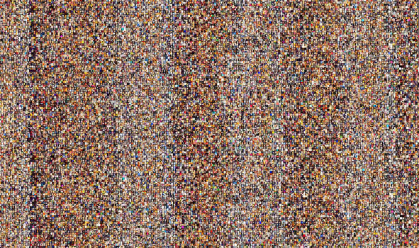
New York
 50,000 Instagram photos from NYC, organized by hue mean (radius) and brightness mean (perimeter).
San Francisco
 50,000 Instagram photos from San Francisco, organized by brightness median (radius) and hue median (perimeter).
Tokyo
 50,000 Instagram photos from Tokyo, organized by brightness mean (radius) and hue mean (perimeter).
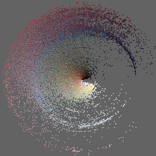
Bangkok
 50,000 Instagram photos from Bangkok, organized by brightness mean (radius) and hue median (perimeter).
Rhythms, Filters, and Crisis
 A detail from Montage visualization of 53,498 photos from Tokyo.
Planetary-Scale Visual Rhythms
Visualizing user-generated photos according to location, time or multiple visual attributes reveals a particular “visual rhythm” or “visual signature” of each location, unfolding spatio-temporal variations in color, numbers of shared photos, and visual affinities.
For example, we can organize all images according to their upload time, thus capturing the “visual rhythm” of a place (recurrent shifts of day and night manifested in changing visual attributes) as it unfurls over time (see visualization on the left). Alternatively, we may organize all images from a specific time period and place according to average brightness or average hue of each photo, thus revealing a “signature” of dominant visual preferences.
From Big to Thick Data
Zooming into a particular city in specific times, we suggest that social media can also be used for local reading of social and cultural activity. In other words, we do not necessarily have to aggregate user generated content and digital traces for the purpose of Durkheim-like mapping of society (where individual people and their particular data trajectories and media diaries become invisible). Instead, we can do “thick reading” of the data, practicing “data ethnography” and “data anthropology.”
We use a sample set of Instagram photos uploaded by users in Tel Aviv during days of national events in the city (on the right), as well as photos taken in the Brooklyn area during the recent hurricane Sandy. We visualize these photos in multiple ways, and show how such visualizations can lead to cultural, social, and political insights about particular (local) places and particular time periods (see our article for this analysis).
 A detail from Plot visualization by time of day per 289 users.
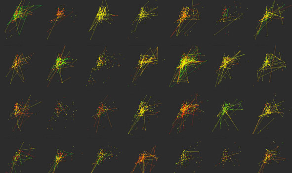
Visual Routines
While our methodes allow us to trace the collective visual rhythms of a place, we can also identify particular visual routines of individuals in that place. For example, we visualize individual users’ visual social traces in the city of Tel Aviv, Israel over three months time (on the left). Each plot in the matrix shows locations of photos shared on Instagram in Tel Aviv area. The green to red color gradient indicates the time when a photograph was shared (green-morning, yellow-afternoon, red-evening). A line is drawn between two photos/dots that were taken within the same hour.
The result clearly shows various user’s activities: a few users take many photos in one area, others move rapidly across the city. Several users never take more than one photo per hour, while others take many photos over short periods of time. Some take more photos during early mornings, while others only take photos during the late evening.
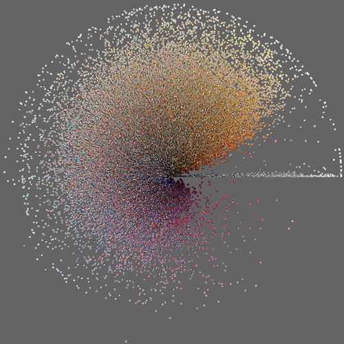
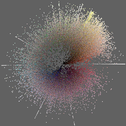
Cycles of Time
We focus on exceptional times in particular places, and show how changes in volume over time, spatial patterns, and visual features of Instagram photos can offer insights about people’s activity during these dates. To visualize these tempo-spatial changes, we organize Instagram photos in radial forms.
On the left, for example, photos are organized similarly to an analog clock: the position of the hands (angles) represent time. In addition, the length of hands (the distance from the center) represents hue. In another case, we organize the photos according to their location (angle) and time (distance from the center), or according to the filter used to manipulate the image before uploaded to the application.
These new forms combine the temporal, the spatial, and the visual aspects of our data into a singular visualization that allows us to explore particular photos in specific locations and times.
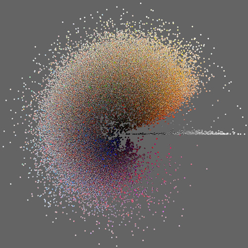
 A detail from Radial plot visualization of 24 hours from the Brooklyn area during hurricane Sandy.
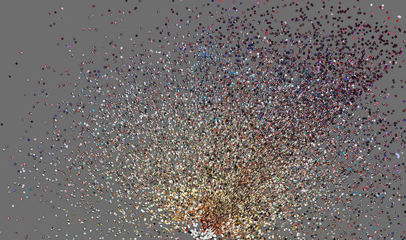
Crisis Mapping
Our visualizations tools also allow us to track changes in photo taking activity in near real-time. For example, we visualize Instagram photos taken during Hurricane Sandy in Brooklyn, NY and detect behavioral patterns during emergency times as they are reflected in users’ photos.
On the left is a radial plot visualization of 23,581 photos taken during 24 hours in Brooklyn area during hurricane Sandy (November 29-30th, 2012). The photos are organized by time (angle) and hue (distance from the center). Note the line marking a change in the number of photos and their brightness, corresponding to the moment of the power outage in the area. This sudden and dramatic visual change (compared to normal day and night rythms seen in our other visualizations) reflects well the intensity of the human experience during the event.